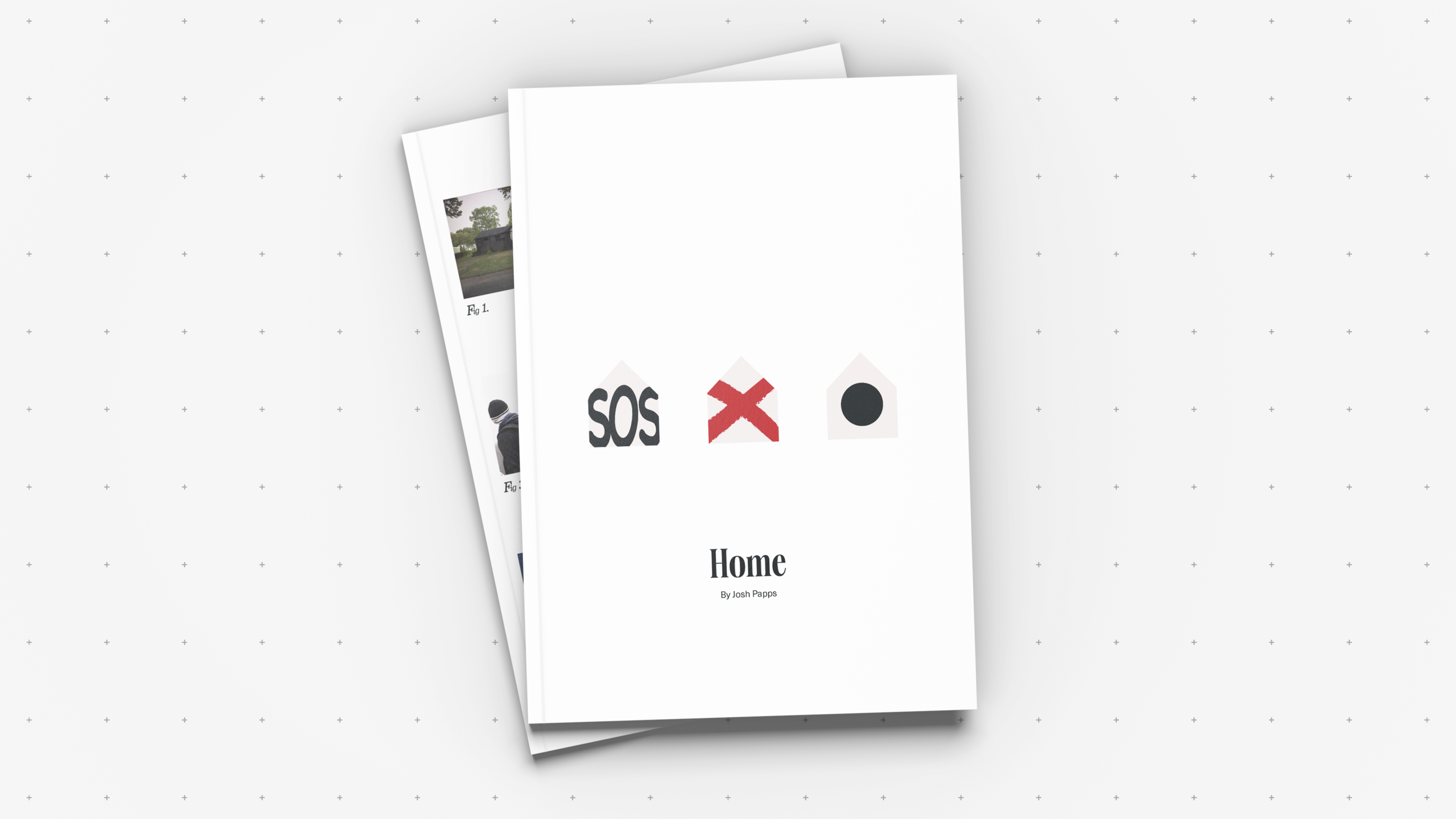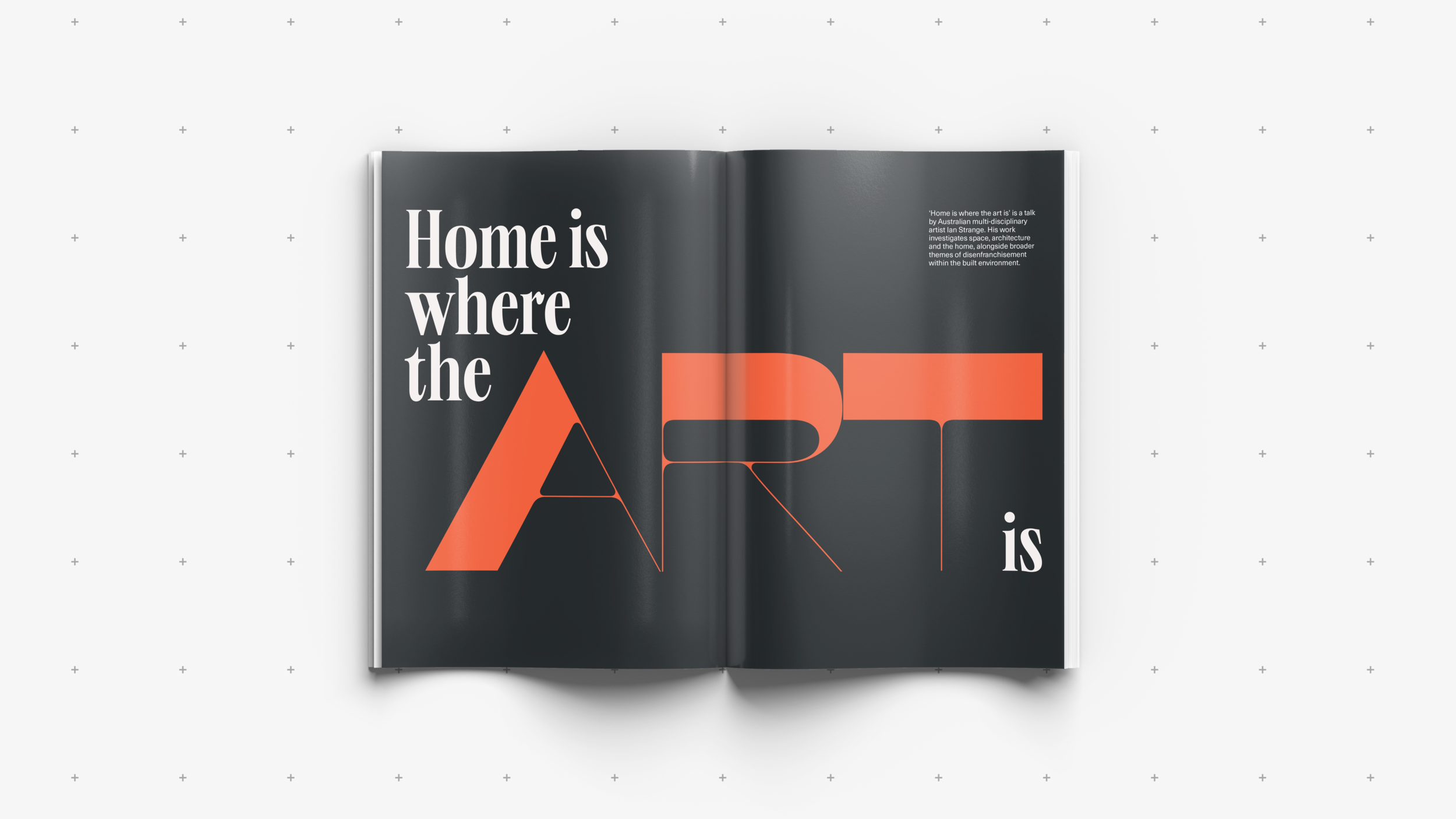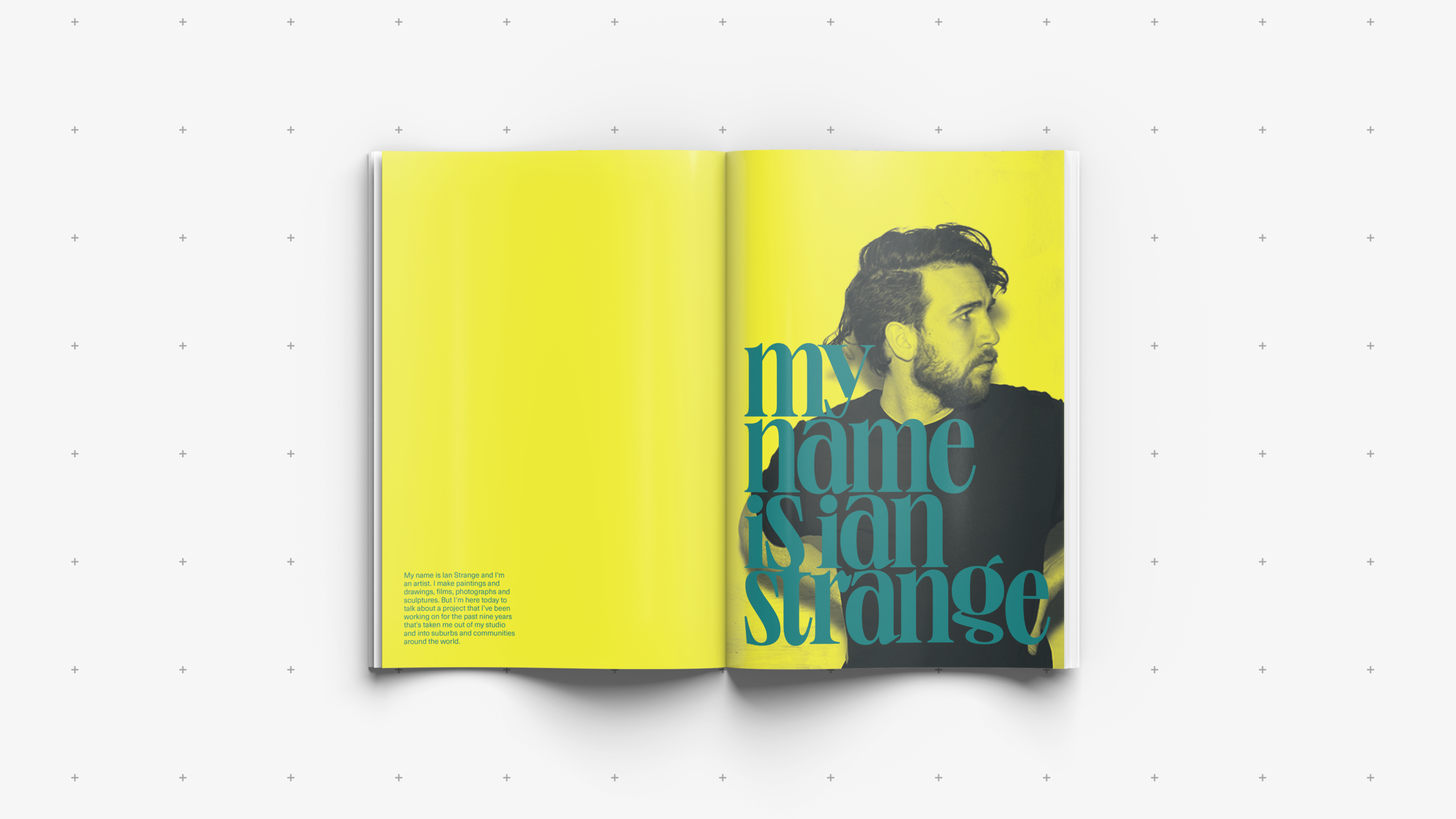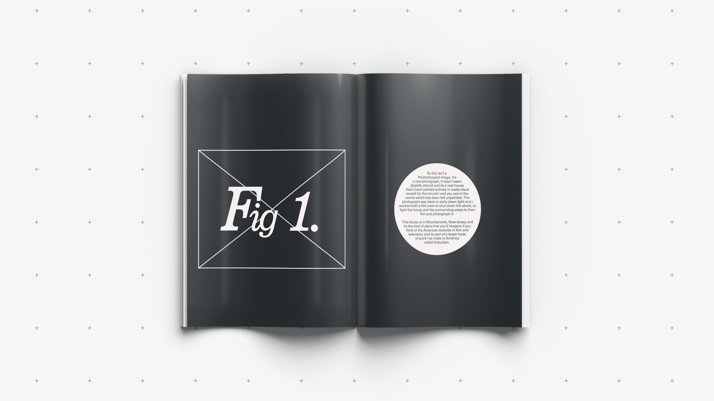
Typographical experiments portraying the art of Ian Strange.
Brief By AUB, James Ward
Discipline Editorial, Print, Typography
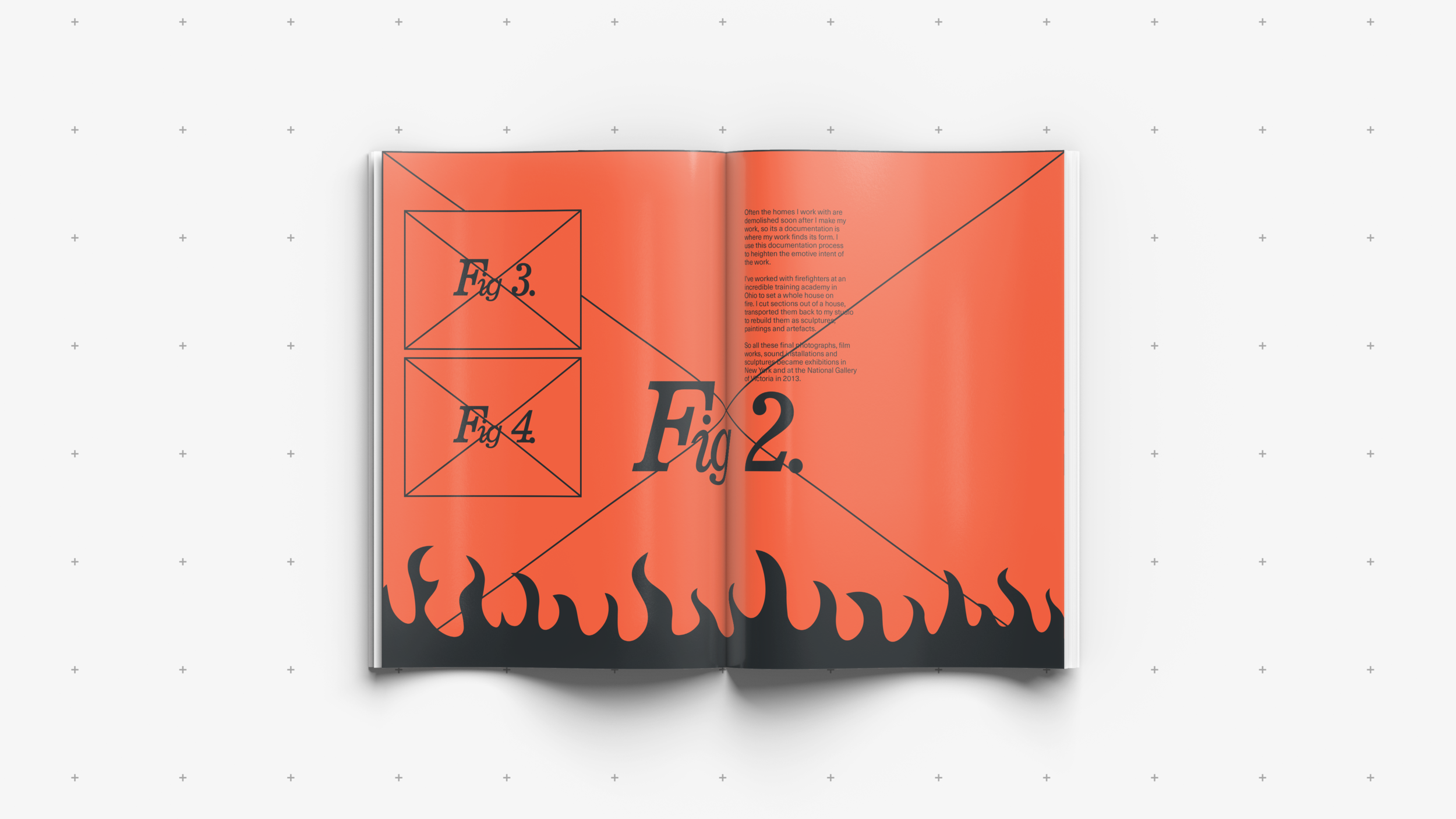
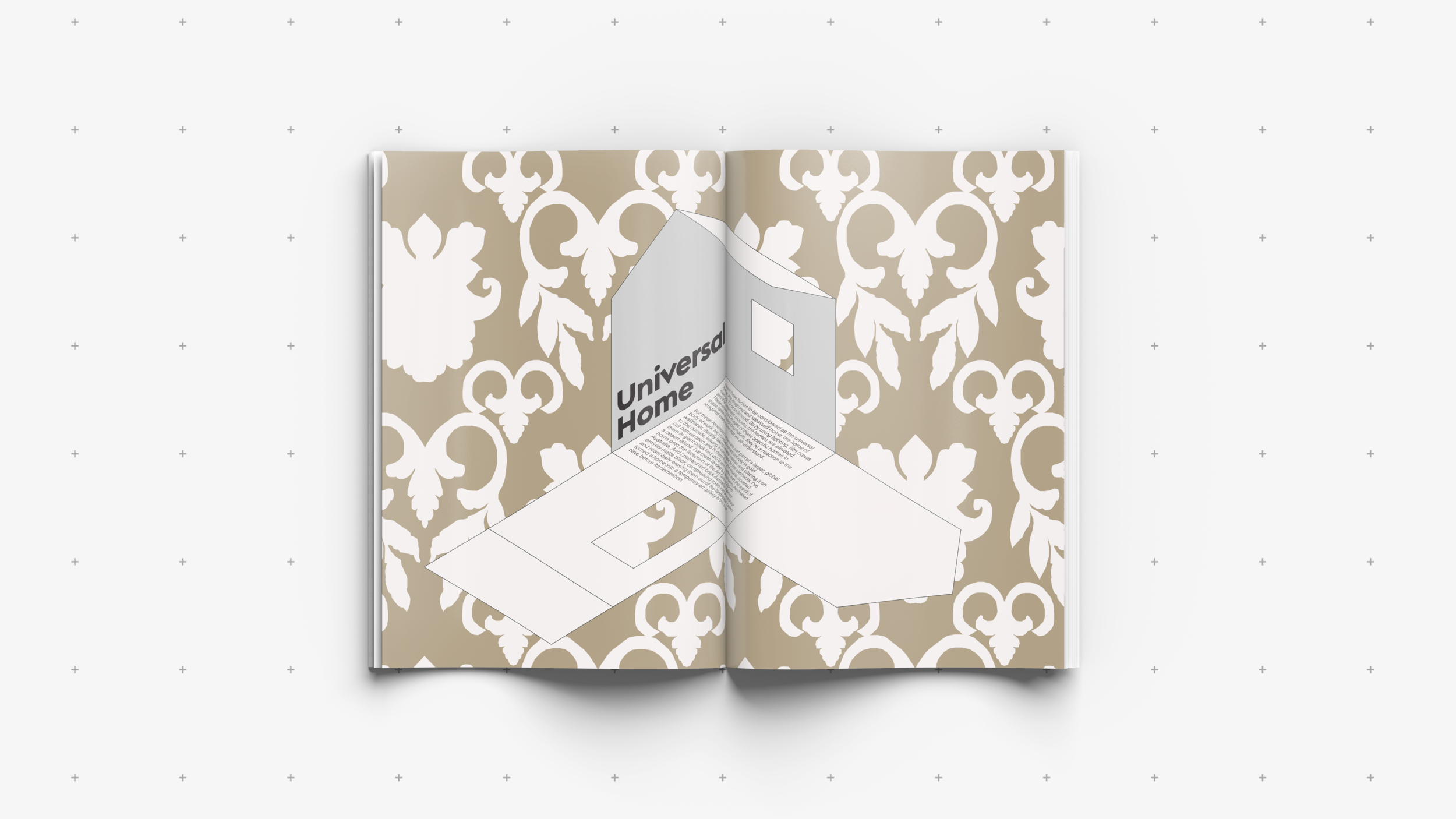
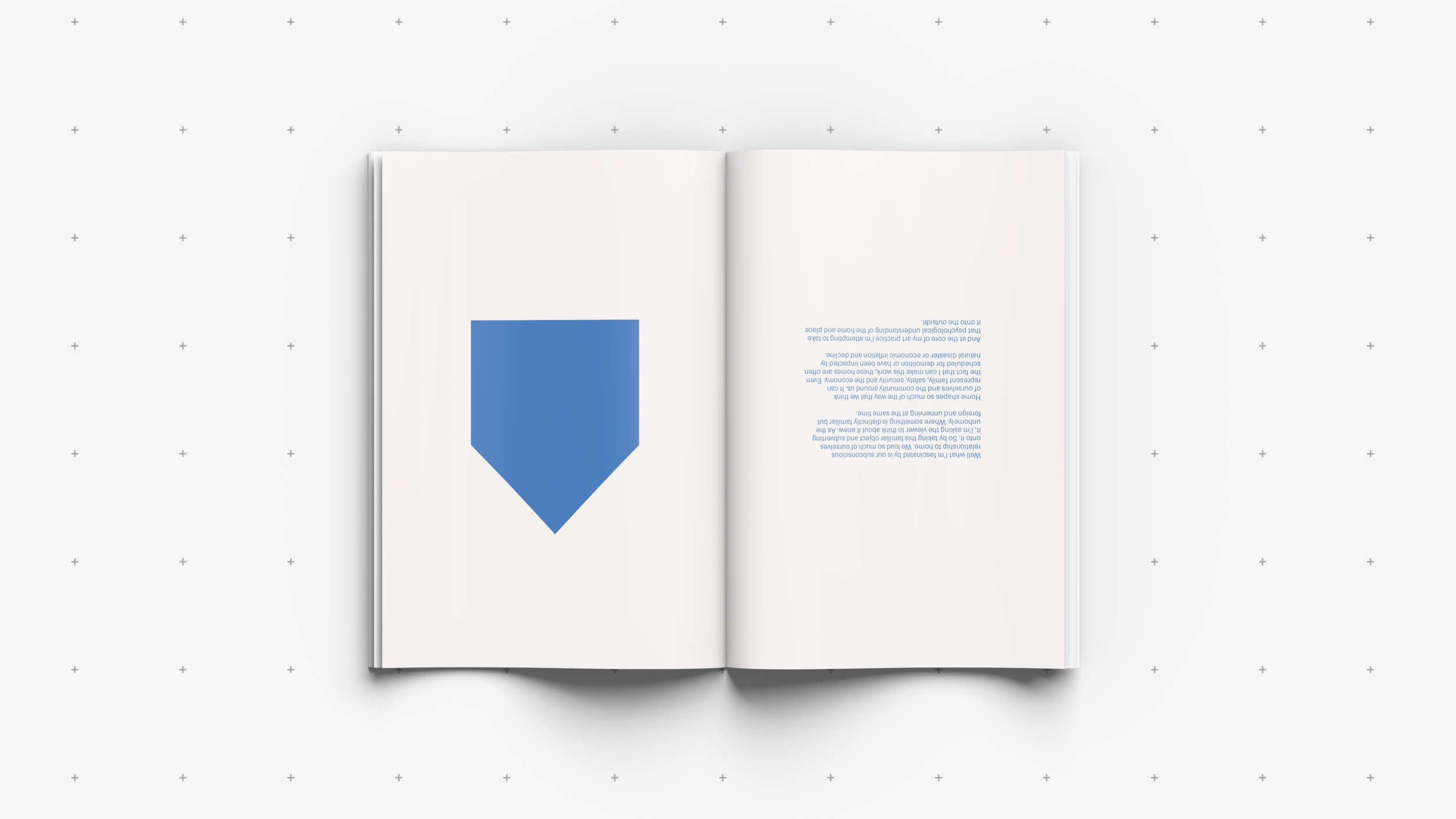
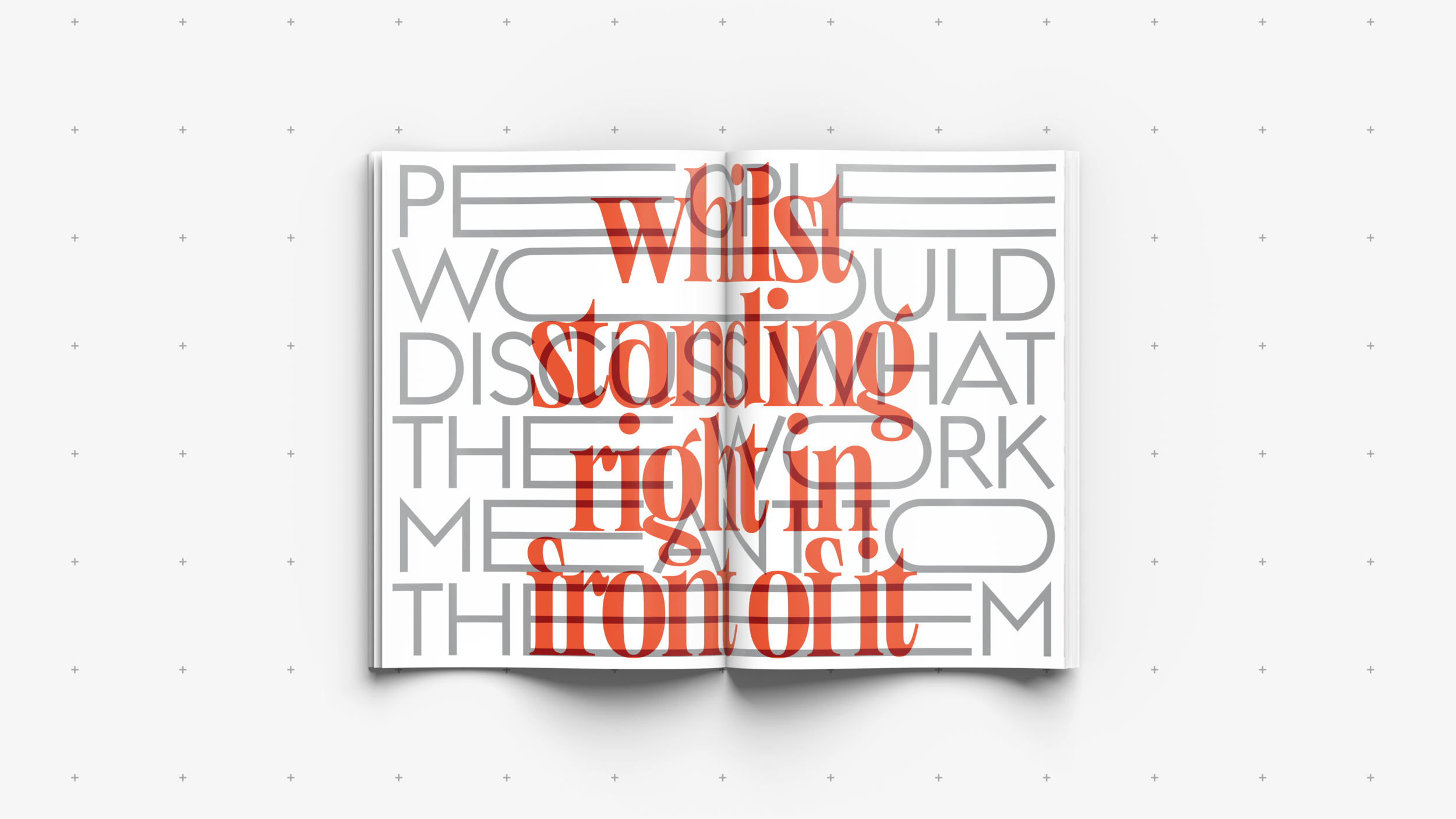
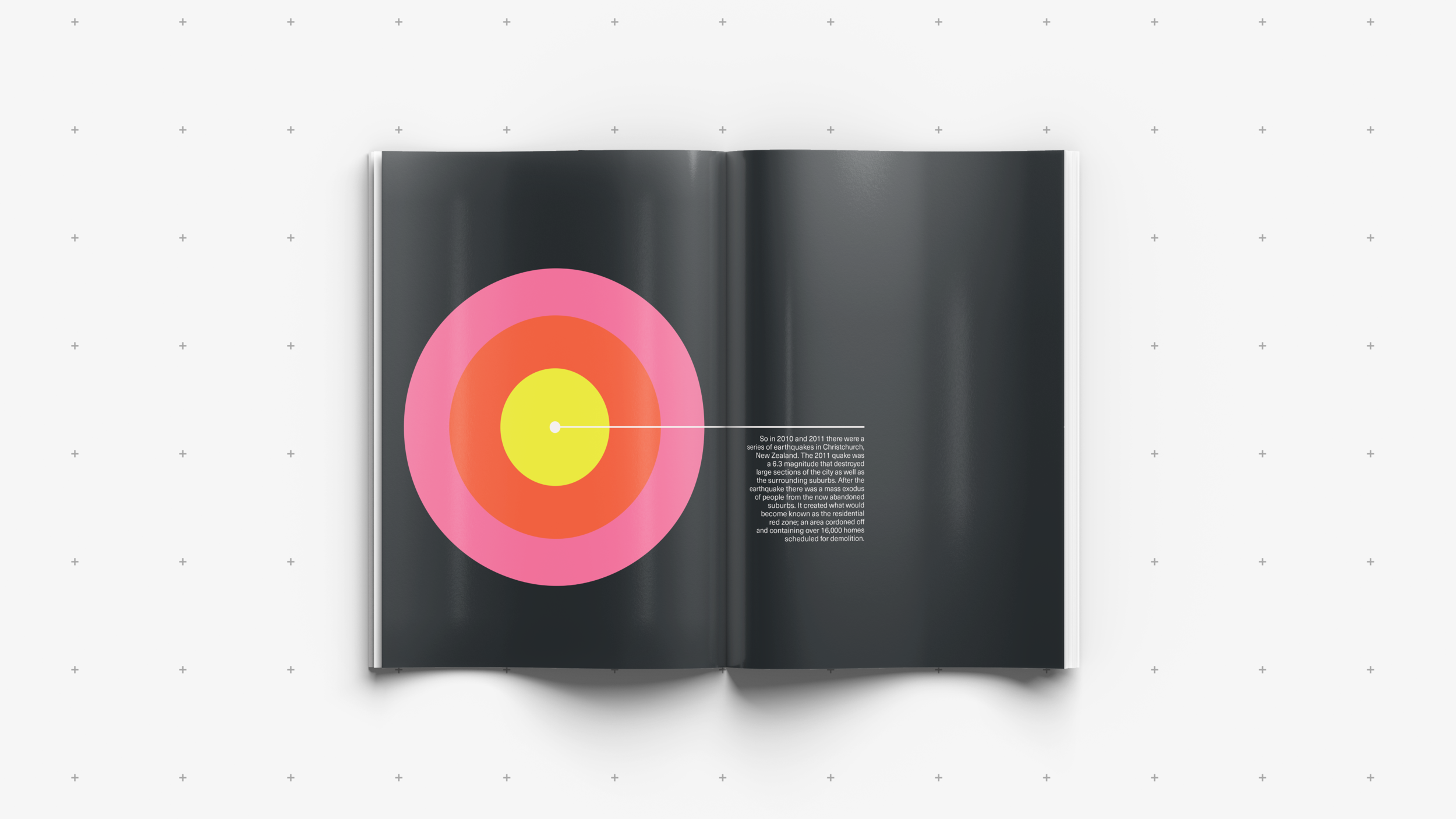
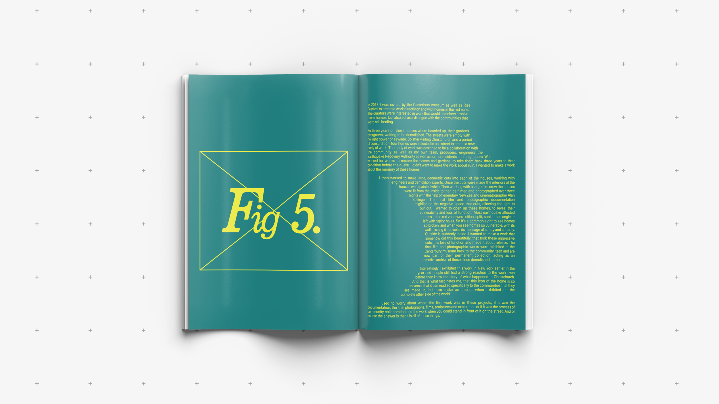
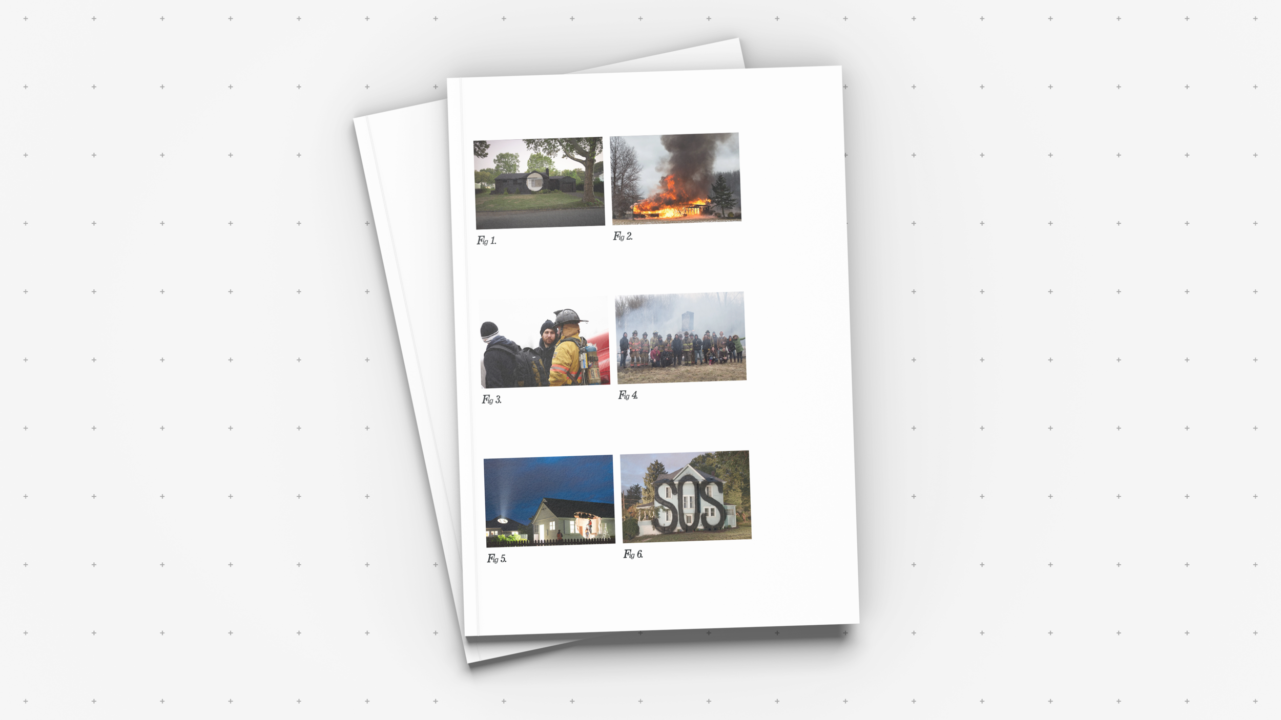
Based off the brief ‘Conceptual Characters’ I was tasked with creating a publication formed around a typeface. I chose the typeface Trevor designed by Teo Tuominen, a narrow and sturdy slab serif. The word Trevor comes from the Welsh tre(f), meaning ‘homestead’ or ‘settlement’ and this planted the seed for the rest of the project. As a designer, I decided to look at how the idea of the home can be interpreted by art and design and therefore came across the work of Ian Strange. Strange is an Australian multi-disciplinary artist whose work investigates space, architecture and the home, alongside broader themes of disenfranchisement within the built environment. His Ted Talk ‘Home is where the art is’ formed the basis for my publication, with the aim of final outcome being to interpret the context of the talk as well as his art through typography rather than imagery. As a result, no images are used throughout the main publication, instead utilising a figure list on the back cover to link Strange’s work back to the relevant pages.
