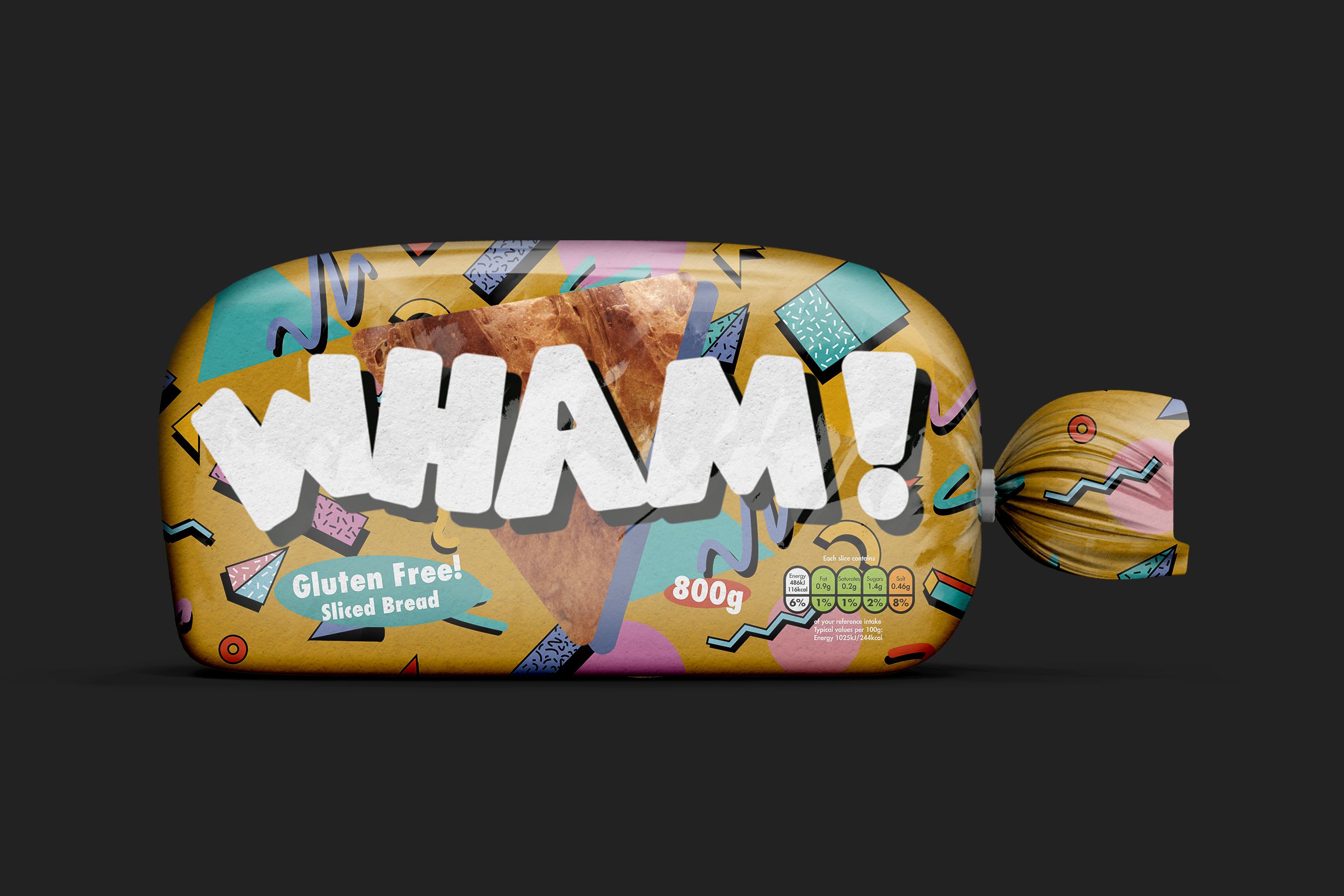
Packaging and branding design for a new bread brand aimed at millenials.
Brief By JDO RAW Competition
Discipline Branding, Packaging
WHAM! is a new brand of gluten free bread aimed at millenials. The bread segment is dominated by traditional brands such as Hovis and Warburtons that all follow a similar design style and, therefore all blend into one another on the shelf. I decided to make the brand focus on gluten free products as this is a relatively new segment that is currently experiencing an explosion in popularity as existing brands are late to realise its potential. As a result, it’s the perfect area for a new brand with a fresh aesthetic to come in and establish itself.
What’s in a name?
informal - exclamation - /WAM/ Used to express the sound of a forcible impact.
Mimics the impact that the brand will make on the existing, stagnating bread marketplace.
In order to appeal to the target audience of millennials, I decided to focus the brand identity on retro ‘90s styling. This is because millennials will have grown-up during this decade and the brand therefore aims to evoke a sense of nostalgia back to their childhood (one of the most impactful stages of a person’s life), persuading consumers to purchase the product. Furthermore, retro styling such as in the fashion world is very on trend right now and, this helps the product to evoke that nostalgia whilst not feeling out of place. As a result of this the packaging prominently features bold type, pattern and colour, reminiscent of ‘90s styling and this is something that is carried throughout all touchpoints of the brand.

Taking inspiration from famous ads of the time such as those produced by NIKE and NINTENDO; WHAM! utilises a clean and bold sans-serif typeface, bright colours and light-hearted imagery throughout in order to draw viewers in as well as tell a story. Finally, the product is highlighted in these ads by being in full colour, creating a strong contrast to the characters which are black and white. This also helps to tie back to the packaging itself; as the window not only allows the product to be seen but also contrasts with the rest of the bag’s imagery.


